Tetherow Resort
(SPEC)
Tetherow lacks brand recognition and a clear identity. Tetherow Resort needs to establish itself as not just a golf course but as the premier luxury resort in Bend. The challenge Tetherow faces is to establish this identity well still remaining authentic to the Bend area. To do this, I created a new logo and style guide that focused on elegance and simplicity and a campaign that highlights the natural beauty of the golf resort.

The Logo Redesign
The previous logo is overly complicated and does not communicate the brand’s identity. The new logo communicates sophistication through the shield emblem and typography while still remaining simplistic and scaleable. The color scheme and brand name retain a similar look and feel as the previous logo.
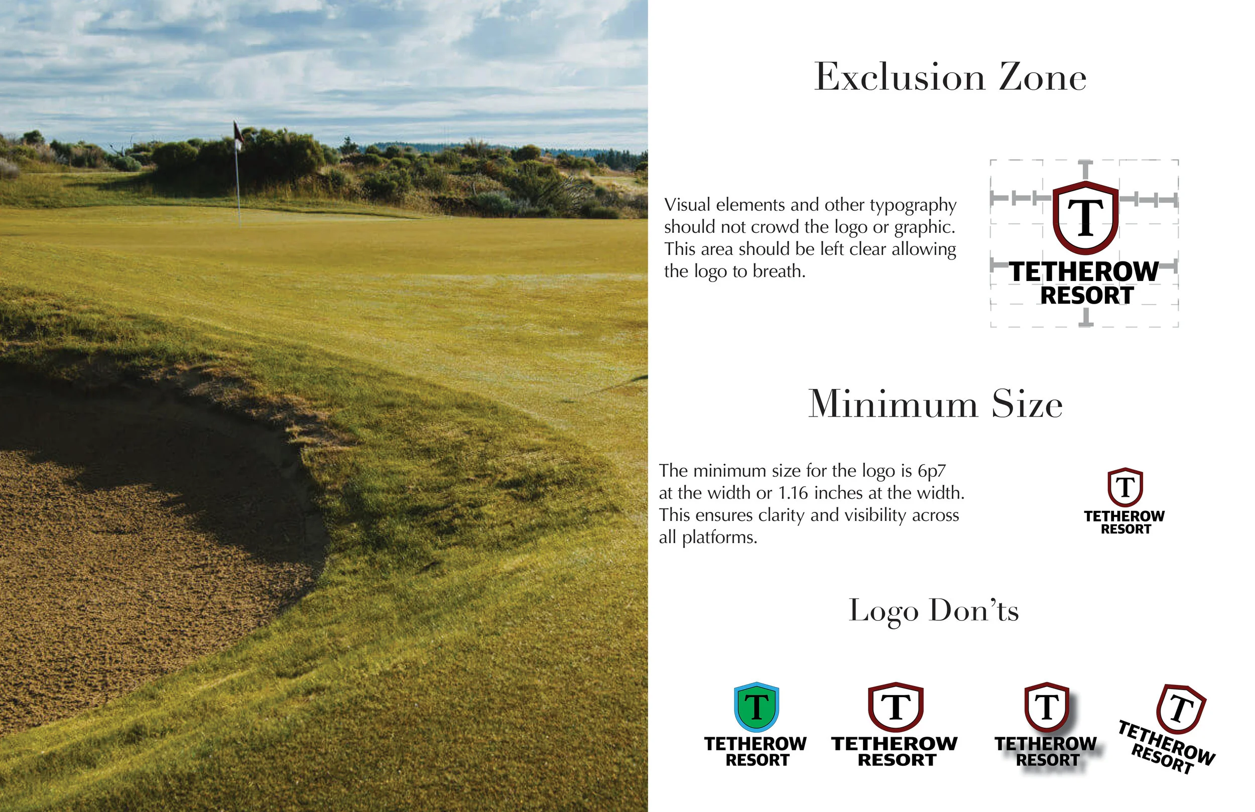
The Style Guide
The brand style guide solidifies the brands identity, creating clear guidelines for look, feel and tone across all platforms.


The Campaign
The campaign marries all aspects of the Tetherow experience establishing it as a luxury brand, while highlighting the unique environment and community that Bend, Oregon offers.


Young Rider Magazine Design
The original magazine’s design did nothing for the reader. It was disorganized and did not have a clear sense of style. The goal of this redesign was to improve the typography to making it more elegant and sophisticated and to improve overall layout and organization in order to meet reader and advertiser goals. Most articles are pulled from the internet while some are filler text.